Branding, Logos & Mockups
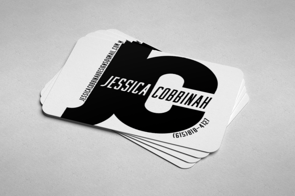
Inspired by a prompt from my Coursera graphic design course, this business card focuses on using typography rather than imagery to communicate style as well as information. The bold font of my initials and the “cutout” of my first name came from experimentation with scale, weight, and composition that I then embellished with my email address and phone number, allowing relevant information to be communicated without distracting from the main design.
Created in Adobe Illustrator.
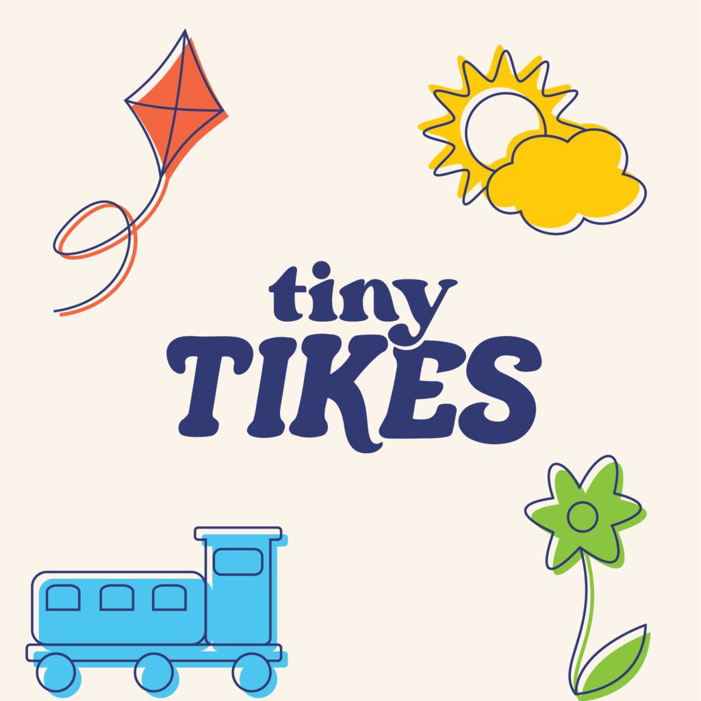
This brand identity was created in response to a practice brief from Brief Club on Instagram. While I initially went in a different creative direction with modified icons and a different color scheme, I found myself struggling with not feeling a sense of cohesiveness, and the overall branding didn’t feel youthful or enticing.
Before making the necessary adjustments, I had wanted to use more classic, muted colors to appeal simultaneously to children and the adults purchasing the clothes on their behalf, but I ultimately decided this wasn’t the right direction and modified my color scheme to align more with both the brief and similar branding in the children’s clothing market.
Created in Adobe Illustrator.
Full branding suite
Former branding


