Posters & Social Media
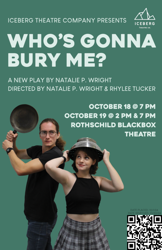
This 11×17 poster was created to advertise an upcoming production of a friend’s play. Similarly to the poster for Enter Macbeth, I was able to read the script prior to designing the poster and knew the overall tone of the story. My friend and I discussed her version for the poster, which was in a style reminiscent of posters for the National Theatre London and book covers by graphic designer Elisha Zepeda.
To achieve this, I started looking for a bold sans serif font that still had personality and distinction. I then explored background colors that were bold enough to stand out on screen and in print and would complement the two actors’ skin tones. I manipulated the layout to prioritize the title and the models while still featuring the dates, attribution, and QR code clearly, and lastly, I included the university-mandated poster placement and takedown dates in a low-contrast but still readable color.
To create the Instagram version, I placed all the elements on an 8×8 canvas and spent most of my time making small adjustments. With the removal of the QR code, I struggled to not have massive gaps until I placed the models so there was some overlap with the title text.
Created in Photoshop.
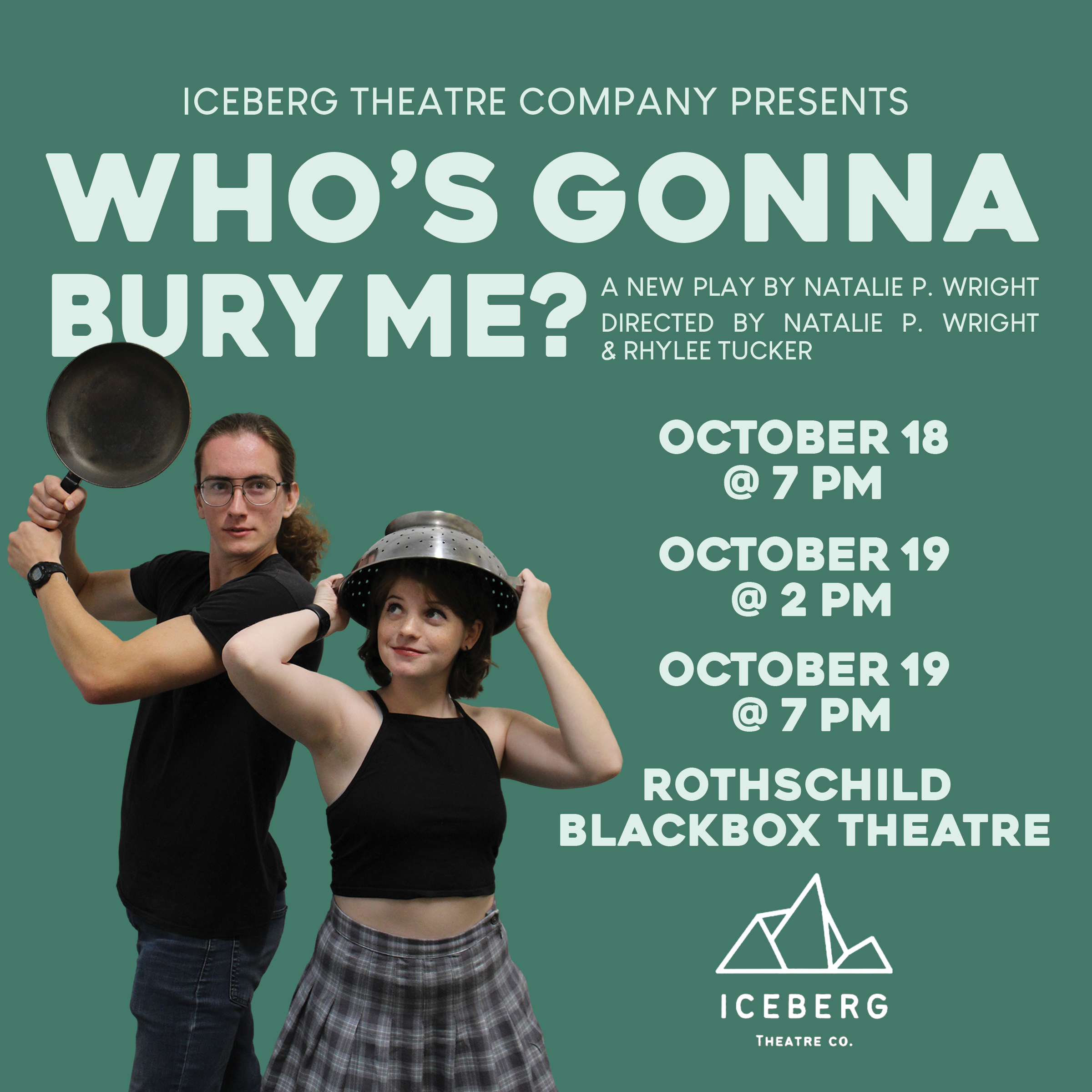
Instagram version
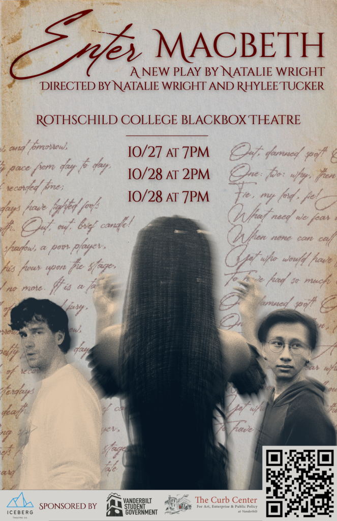
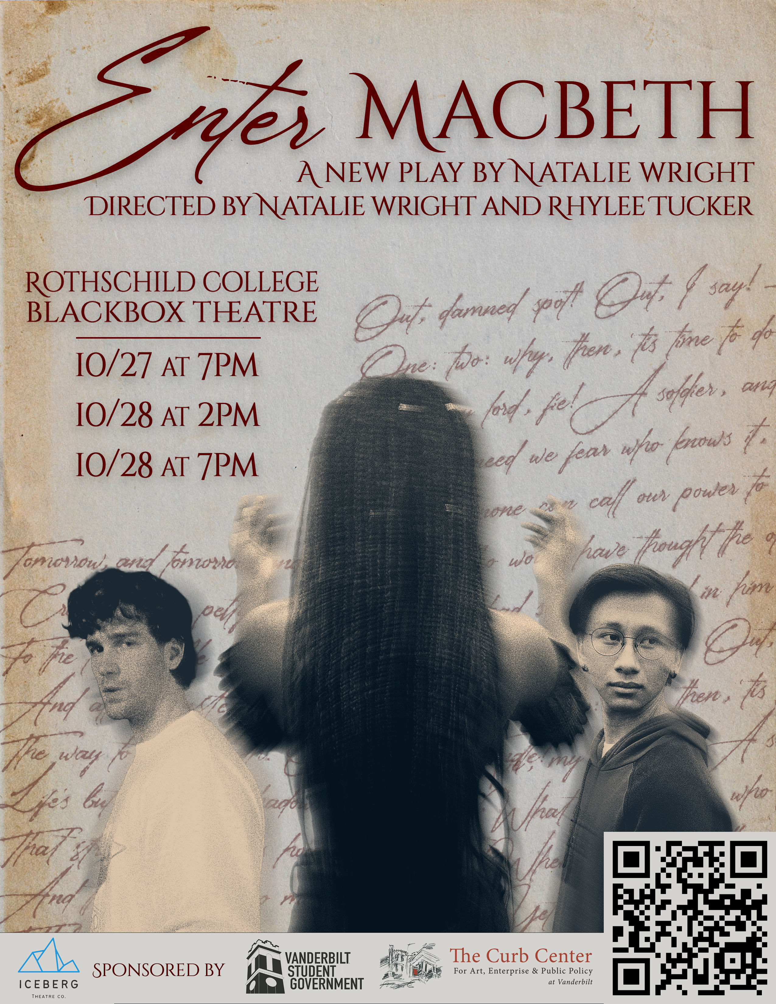
This 8×10 poster advertises a play written by a friend of mine. Having read the play, I understood the tone of the piece and worked to include elements that captured it, such as aged parchment to reference the importance of Shakespeare to the plot, script from the original text of Macbeth in a deep red to symbolize blood, and a distortion effect around the three central figures to symbolize their conflict.
This size was printed for posters around campus as well as included as the cover of their printed programs. I also created a 11×17 version for a larger poster hung outside of the venue and a square-shaped graphic for Instagram, both of which required layout adjustments.
Created in Adobe Photoshop.
Instagram version
11×17 version
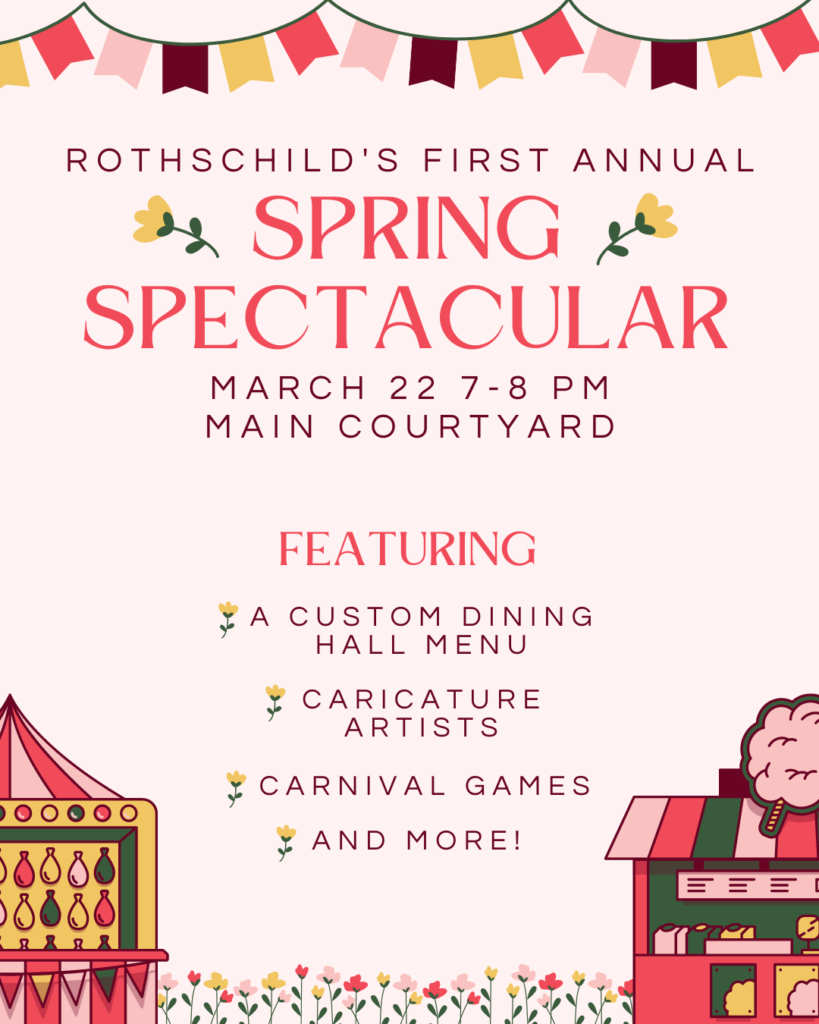
Created during my time as the Public Relations chair of my residential college’s council, this poster advertised the first
edition of our flagship event, the Spring Spectacular. We wanted to attract residents using the theme of a carnival, prompting me to find elements that would communicate this theme while not overwhelming the design. While creating the piece, I focused on information hierarchy and an even distribution of the color scheme, and I used various elements to construct the smaller flowers used as bullet points in a style reminiscent of the preexisting flower element along the bottom.
Created in Canva.
Alternate version featuring raffle event.
Details coming soon!
Created in Canva.
Details coming soon!
Created in Canva.
Details coming soon!
Created in Canva.
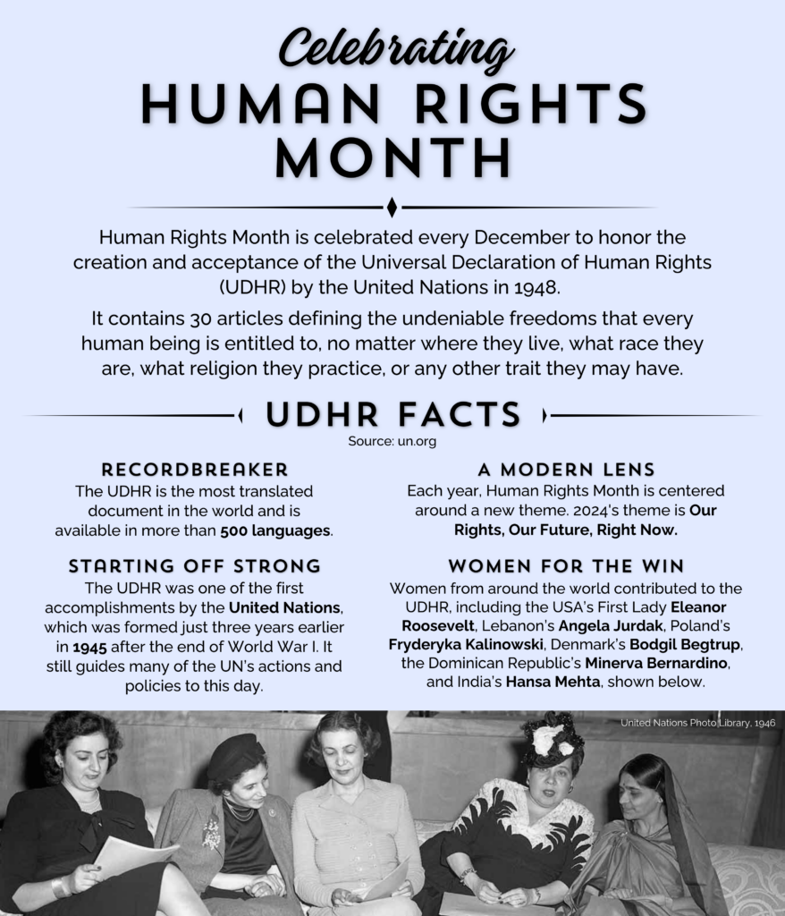
Details coming soon!
Created in Canva.
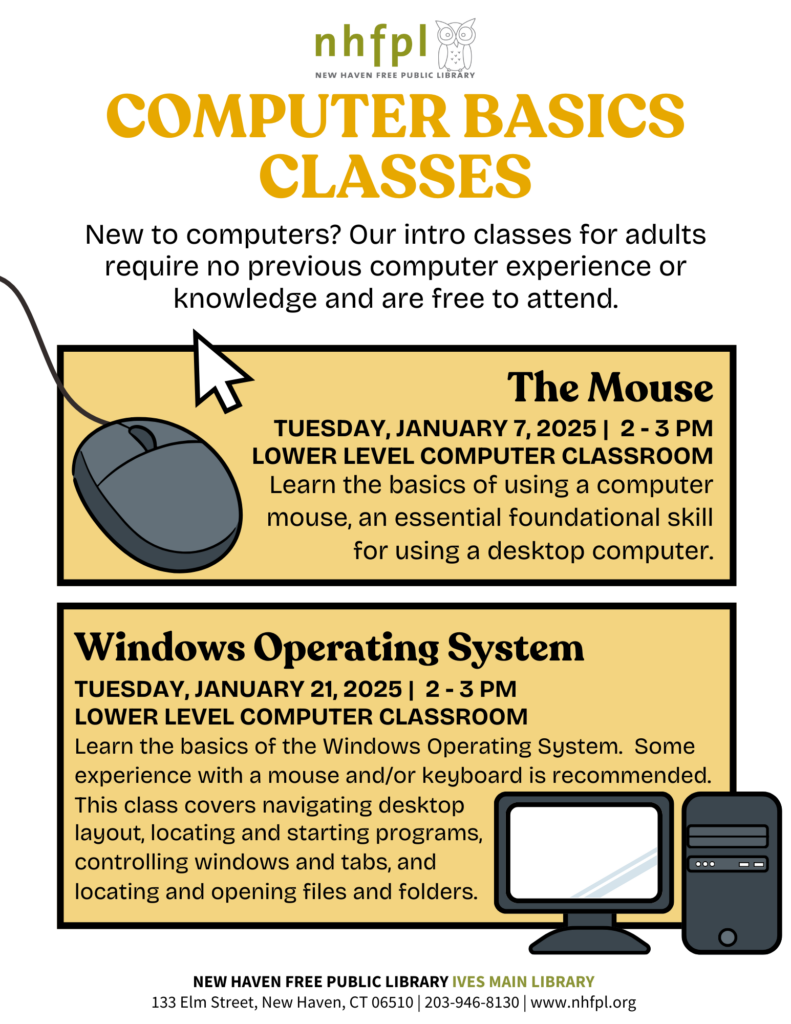
Details coming soon!
Created in Canva.
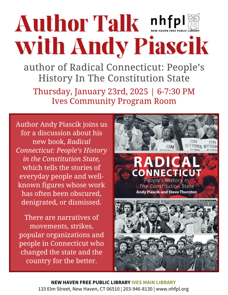
Details coming soon!
Created in Canva.
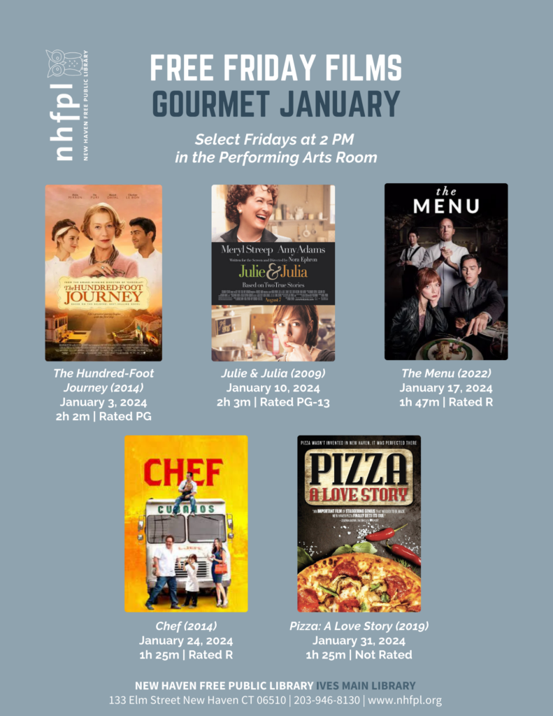
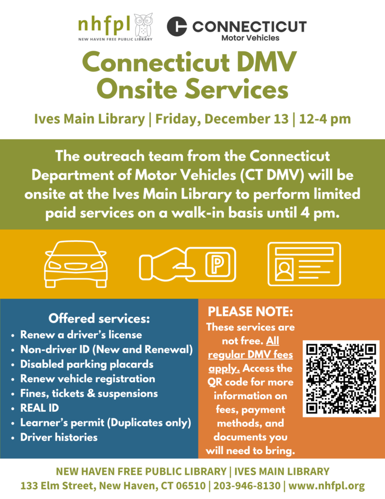
Details coming soon!
Created in Canva.
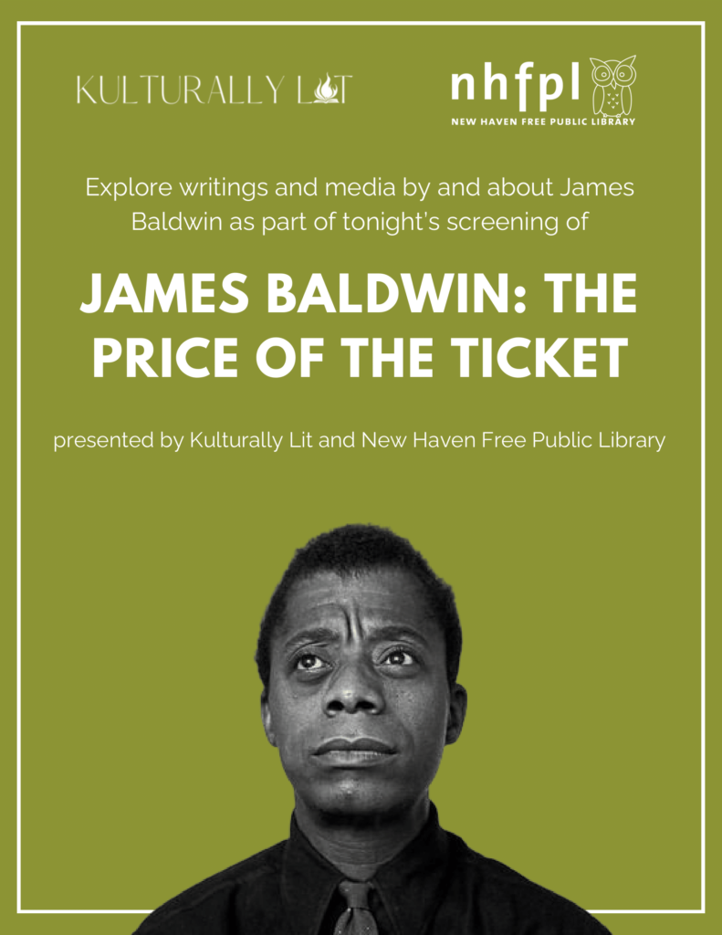
Details coming soon!
Created in Canva.
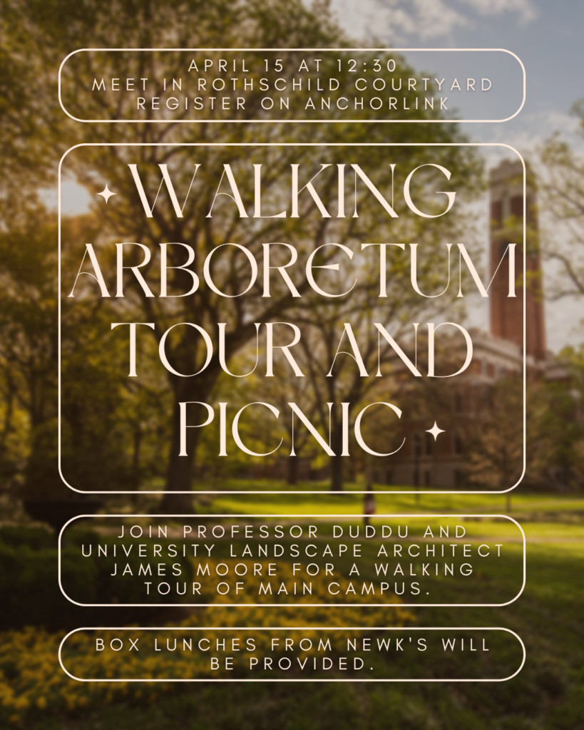
Created during my time as the Public Relations chair of my residential college, this poster advertised a tour of a newly renovated area of campus cohosted by the university’s campus architect and our residential college’s live-in faculty member. I located an open source image of Vanderbilt’s campus for the background, which I blurred and darkened so that it was recognizable while providing
sufficient contrast for the text to be readable.
Created in Canva.
Details coming soon!
Created in Canva.
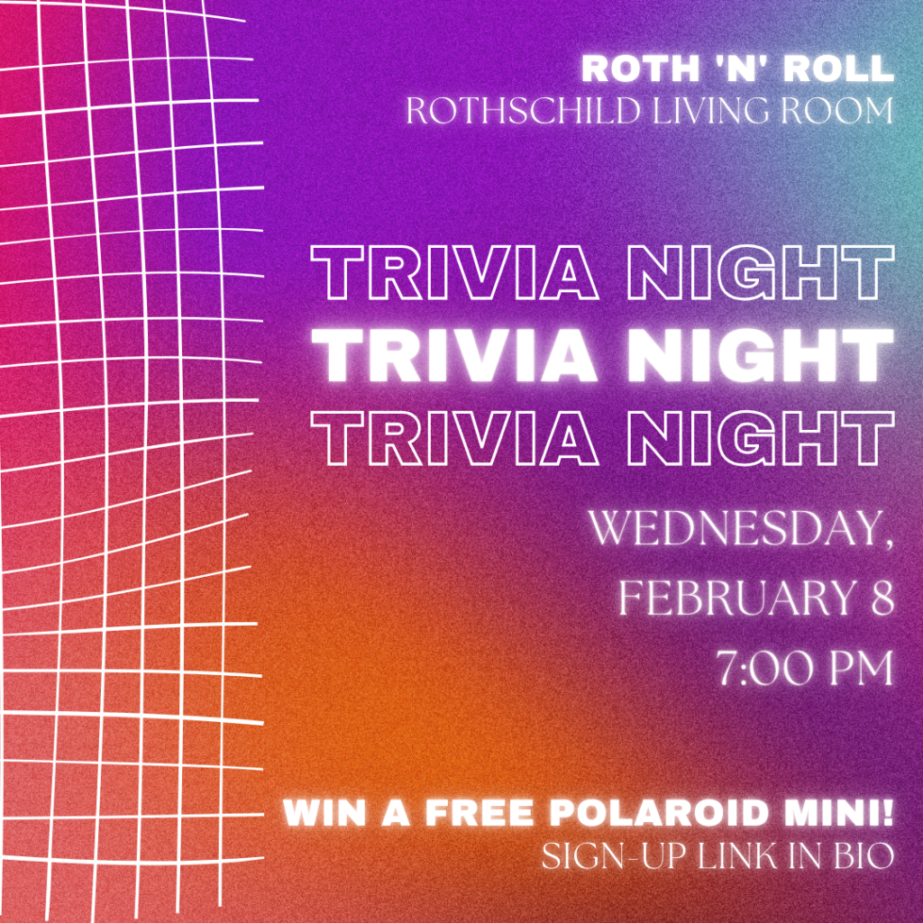
As one of the first Instagram graphics created during my time as PR chair for my residential college, I wanted to establish a new era for my residential college, which was previously using default templates with little customization to advertise events. I first selected the grid element for its visual interest, then located a bright, attention-grabbing gradient background. I then added the glow and outline around the text to mimic a lit neon sign.
Created in Canva.
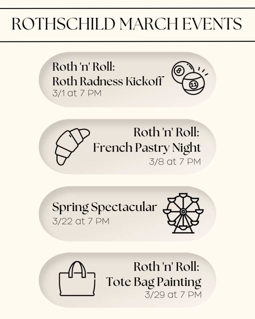
To increase turnout at events during a time of the year when many residents were busy with midterms and other responsibilities, I created this overview of upcoming events to create interest and give people time to factor in events alongside their other obligations. The neutral background allowed for cohesion of the design despite disparate events
while the monoline icons differentiated them and gave students the chance to quickly discern which would be of most interest to them.
Created in Canva.
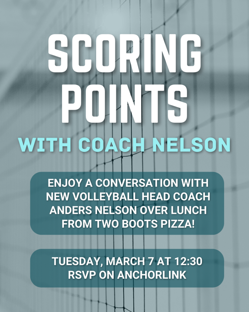
This poster advertised another event with a member of Vanderbilt’s faculty sponsored by my residential college. Since this event required preregistration, I separated that element to draw attention to it. I also applied a transparent
teal background to the image of the net to allow more contrast with the text, but when this did not prove sufficient, I added a subtle drop shadow to the title, subtitle, and body, as well as a transparent teal rounded box around
the body since the typeface I originally chose had a light line weight, but I decided to retain this element even after selecting a new one.
Created in Canva.
Details coming soon!
Created in Canva.

